In the previous post I teach you the basics of the color wheel. Now let’s take a look on how we can apply different color schemes to create some harmonies that are pleasant to the eye.
MONOCHROMATIC SCHEME
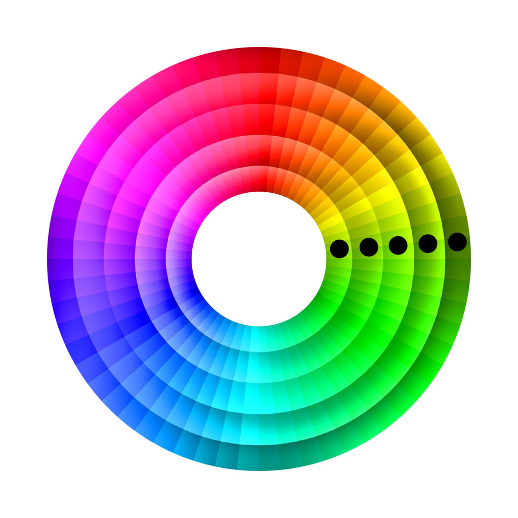
In this case we are going to choose one single color & use different shades. Maybe you will think directly in a black & white picture, or the sepia mode that most cameras have. Those are of course examples of monochromatic schemes, but you can also have it in color pictures.
The key is to pick one color and change its saturation and its darkness (value). You can check this post to learn the notions of saturation & value. By changing these values, it will create a monochromatic color scheme. Usually monochromatic designs are associated with power & restfulness.
Example of monochromatic scheme (Black & White)
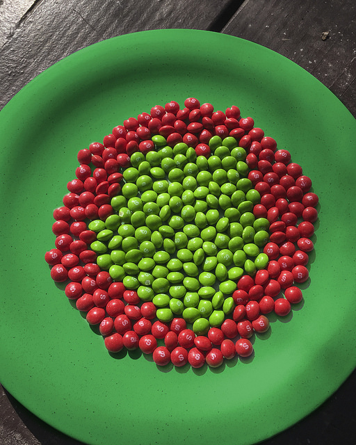
Example of monochromatic scheme (Green)
ANALOGOUS SCHEME
In an analogous scheme you will use 2 or 3 colors that are next to each other in the color wheel. When using an analogous color harmony, pick one color as the dominant one. As this scheme is usually found in nature (plants), it’s used in design to represent serenity & harmony.
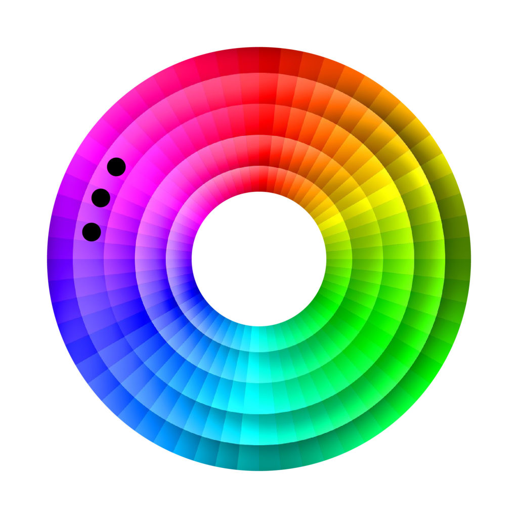
Here some examples of analogous schemes which are not related to nature.
Example of analogous scheme (Purple & Blue)
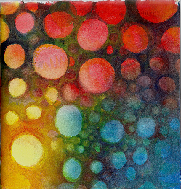
Example of analogous scheme (Orange, red, yellow)
COMPLEMENTARY SCHEME
Another scheme that is probably one of the most popular ones is the complementary scheme. This might be simply because opposites are attracted to each other. In order to create a complimentary color scheme, pick 2 colors that are on the opposite end of the color wheel.
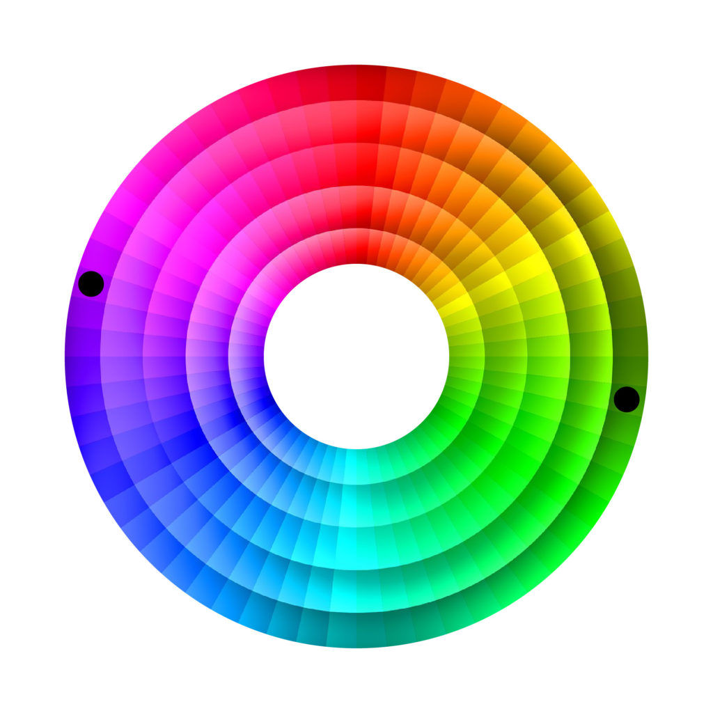
By choosing 2 opposite colors in the color wheel, you are using a warm color & a cool color, this creates visual tension. Usually when the eye is looking at one specific color, it will automatically search for its opposite color to rest, to have some balance. But be careful, don’t use 100% saturated colors and pick one as your dominant color. For the opposite color just use hints of it.
Complementary colors are really BAD to use for text & background in websites.
Example of complementary scheme (Purple & dark green)
Example of complementary scheme (red & green)
SPLIT COMPLEMENTARY SCHEME
Furthermore, the split complementary color schemes is similar to the analogous with a splash of color on the opposite side of the color wheel. It has less visual tension than a complementary scheme and adds some variation.
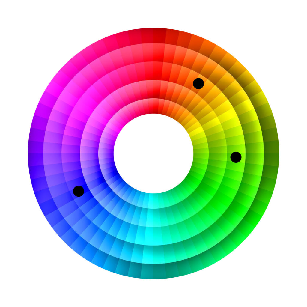
Example of split complementary scheme (orange, blue & green)
TRIAD / SQUARE / RECTANGLE SCHEMES
Finally, in my opinion, these are the most difficult color schemes to create or identify. If they are not used correctly they can be very noisy. They are very hard to achieve as they are very colorful designs. In order to create these types of schemes, select the colors according to the shape (triangle / square / rectangle) of the color wheel. As 3 or 4 colors are used, some company logos take this advantage to represent with each color a specific message.But the meaning of each color will be a topic for a future post :=)


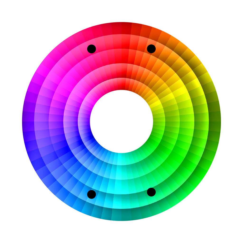
Example of triad scheme (red, blue & yellow)
LET’S PLAY
In conclusion, we have the following schemees: monochromatic, analogous, complementary, split complementary triad, square & rectangle. Can you guess which color scheme is used in each of the following logos? ….. Check the answer below!Â
ANSWER
     Complementary     Monochromatic      Square           Triad
   Analogous              Rectangle          Split ComplementaryÂ
———————————————————————————————————————————————————
See you in the next post! If you like the article, please share it!
Leave a comment if you found this post interesting and let me know with which scheme you feel more comfortable working with.
[shareaholic app=”share_buttons” id=”25934634″]


