In this article I will talk about how to use alignment to improve your design.
Alignment is one of the most important principles of design. It will help provide your design a strong and cohesive structure. A proper alignment will help you create a more appealing design by offering a calmer visual experience.
ALIGNMENT OFÂ TEXT
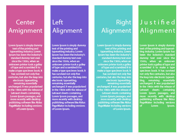
This section is probably the one you better know if you ever use any writing software. To align text you have 4 possibilities:
- Left Alignment
- Right Alignment
- Center Alignment
- Justified
But when you should use each one?
Center: use it when you have few short lines of text. This option must NEVER be use in full paragraphs because it’s difficult to read.
Left: The text aligned to the left is the most common choice. For the reader it’s comfortable and secure. If you want to stay conservative, this is the safest choice.
Right: When you aligned text to the right have in mind that it will require additional effort to the reader. It can be a good option to create more attention to specific words. In other cultures like Chinese or Arabic right alignment is use for reading.
Justified: This option is the most used in books, magazines and newspapers. It’s formal, neat, and helps organize the text, especially if you are using columns. Be careful when justified format creates gaps in your text. You can solve this by changing the words or playing with the font size.
ALIGNMENT OF IMAGES
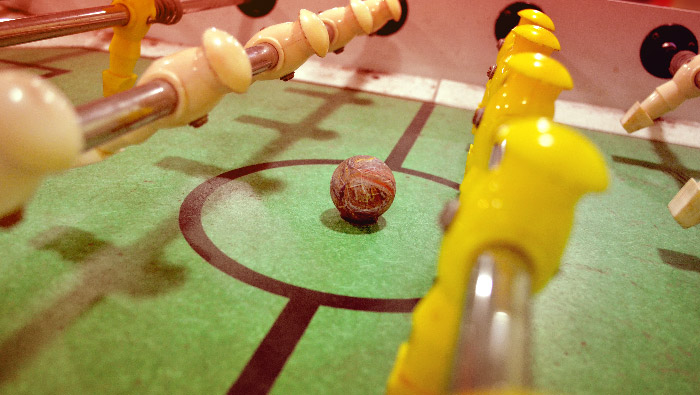
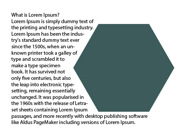
Aligning images is not the same as aligning text. Images have different size and shapes. If you need to place images between texts, you have two options. You can place the images so that they interrupt the content, or you can place the images outside the content. Images that are place outside the content are used in this post. Here an example of an image that interrupts the content.
Finally, in order to align the images you can align their centers, or you can align their edges.
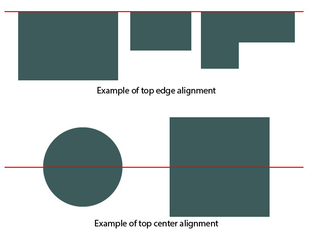
Aligning the borders usually works for images that have the same shape & sometimes the same size. If you have images with different shapes & size it might be better to align the center. Aligning horizontally or vertically is most common. You can experience to align the centers of images in diagonal but it will be more unconventional.
CONCLUSION
By aligning all the elements of your design you create a visual connection between them. A good alignment allows you to create order and organization among elements. Next time you read a magazine or see an advertising or flyer, pay attention to alignment. You will notice that none of the elements are placed arbitrarily. If done correctly, everything was design to create a unique user visual experience. And that is what you should always keep in mind.
————————————————————————————————————–
See you in the next post! If you like the article, please share it!
Leave a comment if you found this article useful & share your thoughts regarding alignment.
[shareaholic app=”share_buttons” id=”25934634″]