EMPHASIS DEFINITION
Emphasis is the focal point of the artwork you create. In every work of graphic design you must make the viewer focus his attention on a specific part of the artwork. It can be a text or an object of the picture. Â The first time the image appears in front of the eye of the viewer, the focal point of the image will take a couple of milliseconds to draw the attention. So how can you achieve emphasis in you graphic designs?
BALANCE
We saw in the previous post the definition of balance. You can used radial balance to focus the attention on the center point of the image.
 Picture from 500px.com by uiethma
PROXIMITY
In order to achieve emphasis on a certain element, grouping objects can help to focus the viewer attention. The elements that you will group together must be related because people to tend to interpret elemts that are near to belong to the same group. Here an example of a pizza hut advertising in which the elements are clearly grouped.
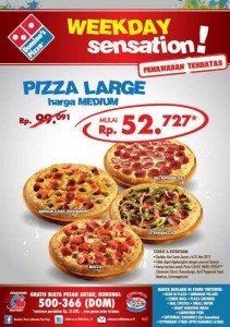 Pizza Hut advertising
ALIGNEMENT
Its important that all the elements of an artwork are correctly aligned. They can be aligned to the edges, left, right, center…A proper alignment will make the visual design more appealing. The main tool that will help you to create good alignments is the grid. A correct distribution of elements will help the user “navigate†the artwork in the correct direction. Nothing is position randomly.
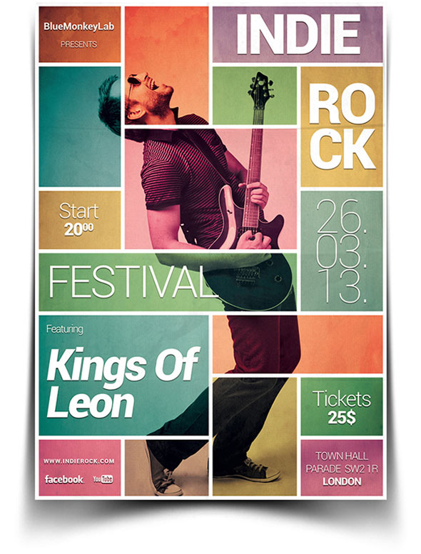 Indie Rock flyer
REPETITION
You can achieve repetition by repeating an image or a word in order to make it more important. You can repeat elements to give a unified look. Imagine power point presentations, usually the template use for each slide has a specific pattern that is repeated to give a unified look. Here an example of a Coca Cola advertising using the bottle as a repeated element.
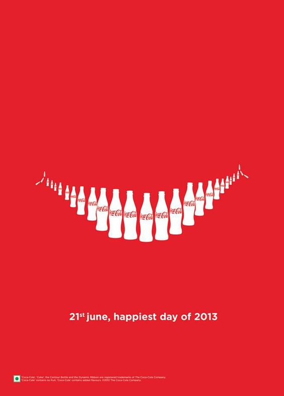 Coca Cola advertising. Â
CONTRAST
Contrast is probably the most common way to achieve emphasis. Setting words in different color or font type will give immediate emphasis. Contrast can make different elements look VERY different.
 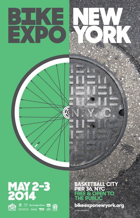
New York Flyer
WHITE SPACE
Isolating a certain element or text can also help to create emphasis. Use white space to isolate elements and give them emphasis. If you want to pass a clear text message, an empty space can provide clarity. Example of white space used in a business card design:
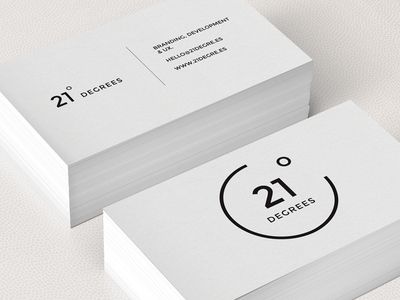 21° Degrees business card.
TIPS TO REMEMBER
- The artwork should have only one one focal point
- There are several ways to create emphasis.
- Combines techniques to create emphasis.
See you in the next post! If you like the article, please share it!
Leave a comment if you found this post interesting and let me know if you know any other forms of emphasis.
[shareaholic app=”share_buttons” id=”25934634″]