In this post I’m going to explain 5 key terms graphic designers must know.
- RASTER IMAGES vs VECTOR IMAGES
- CMYK vs RGB
- TYPOGRAPHIE: SERIF vs SANS SERIF
- WARM vs COOL COLORS
- LOGO vs BRAND
1. RASTER IMAGES vs VECTOR IMAGES
A raster image, also known as bitmap image, is an image that when scale it loses resolution. This is because bitmap images are compose by millions of tiny squares called pixels. Here is a example of the top image on this post zoom at 400%.Â

Scale image composed by pixels (400%).
On the other hand, a vector image can be scale as big or as small as desired but it will never lose quality. This is because vector images are made of paths (lines & curves). An example of a vector image zoom at 1200%.

Scale vector image (1200%).
What should you use?
Raster images have larger file size.
Raster images are typically used for photos. Logos are created using vector images.
This will be main difference when using design softwares, you will need to know if you are working on a raster image or on a vector image.
2. CMYK vs RGB
Rgb stands for Red / Green / Blue. CMYK stands for Cyan / Magenta / Yellow / Black.
RGB colors are additive. This means that when they are mixed together they create new colors. When the 3 of them are mixed, you get white.
CMYK colors are subtractive. Their mix creates black.

What should you use?
It will depend on the application. If you are designing something for web, you should work on RGB. If you are designing something for printing you must work on CMYK.
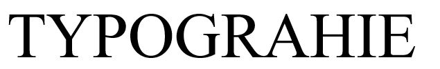
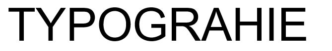
3. TYPOGRAPHY: Â Serif Typeface vs Sans Serif
There are a lot of books about typographie, and probably I will write some posts on this topic. But the first thing I learn about typography was the difference between a Serif Typeface & a sans Serif Typeface. And actually is very simple.
Serifs are the small decorative details at the end of the strokes. That being said, a serif typeface will have these details and a sans serif won’t.
Example of a Serif Typeface (Times New Roman)
Example of a Sans Serif Typeface (ARIAL)
What should you use?
Serif typefaces are the most commonly used typestyle for projects involving lengthy text, such as books, newspapers and magazines.
For other shorter text settings – such as captions, credits, column headings, as well as text in charts and graphs – a sans serif typeface can be a good choice
Â
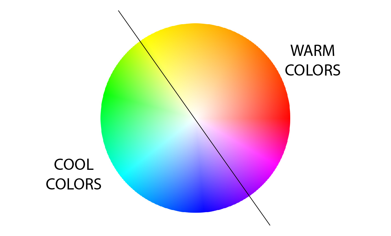
4. WARM vs COOL COLORS
In some previous posts, I spoke about the fundamentals of color. A basic differentiation in colors are the warm vs cool.
Warm colors tend to make you think of the sun and fire. Therefore, you will associate orange, yellow, red. In interior design, they make the rooms feel more cozy.They are more stimulating.
Cool colors (blue, green, purple) are linked to water, nature & sky. Cool colors make things seem smaller or farther away than they really are.
Which one you should use?
Use warm colors in projects where the goal is to convey a sense of happiness, enthusiasm or energy.
Cool colors are often used by businesses because of this notion of harmony. The top color palette among financial institutions, for example, is blue to imply trust and reliability.
You can take a look at my article on color psychology to understand better the meaning of cool & warm colors.
Â
Â
Â
5. LOGO DESIGN vs BRANDING
First, let’s be clear. A BRAND in NOT a LOGO
Its very simply to define what a logo is: it is an image that will recall your business. It is a reminder of your brand.
On the other hand, when speaking about brand, we associate a story, the emotions that are triggered. If those emotions are strong, you will be more associated to that brand. ou brand is the experience people have when they come in contact with your business.
Finally, here is a very nice picture that summarizes this difference.Â
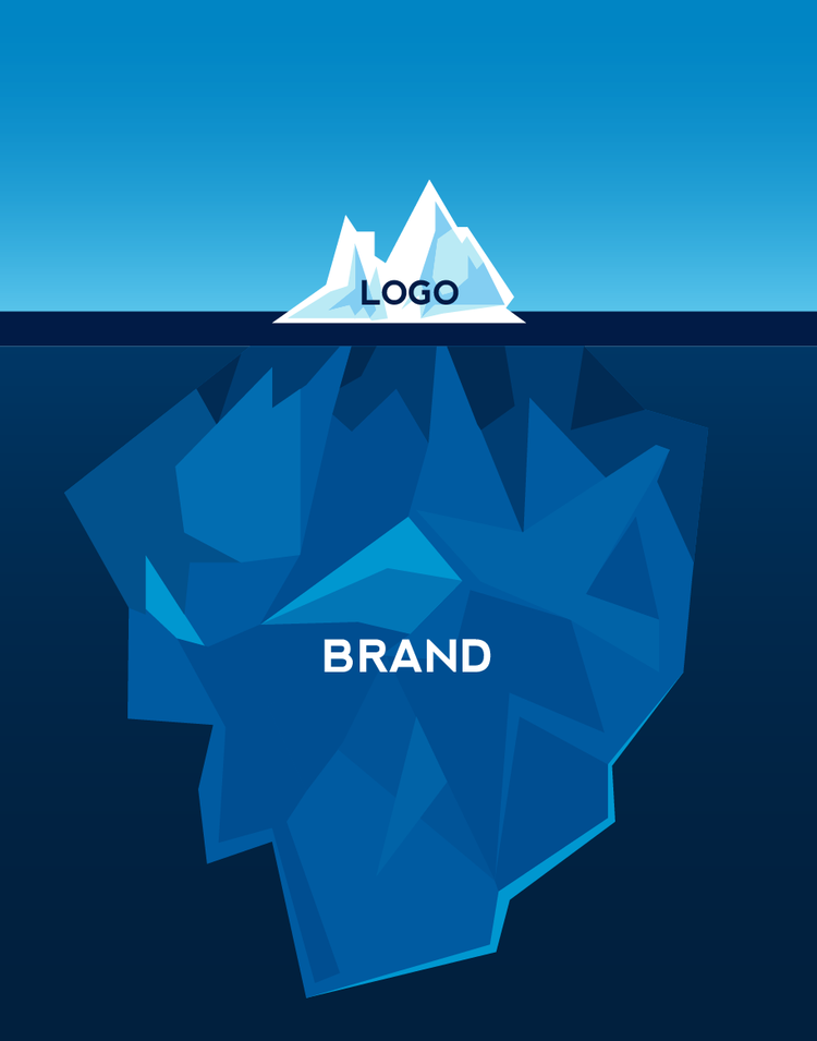
Credit: www.makeroom.ca/about-us/
What you should create?
Well it will depend on what your customer asks. But if they ask just for a logo, have in mind that you need to understand the company vision & values in order to represent them in the logo.
————————————————————————————————————–
See you in the next post! If you like the article, please share it!
Leave a comment if you found this post interesting.
Let me know if you want to learn about any specific terms you might not understand!
[shareaholic app=”share_buttons” id=”25934634″]