The Oxford dictionary defines “patterns” as a repeated decorative design. In graphic desing, we translate this as a repetitive arrangement of shapes, lines or objects elements that are repeated in the same way thoughout the whole composition.
Here is list of ways how you can use patterns.
BACKGROUND: Icons patterns
In case they are used as backgrounds, they must be with a small opacity, almost transparent, so that they don’t disturb the eye of the viewer. Take the example of teh webiste socialist.st, in order to create their background they used icons that represent their products.

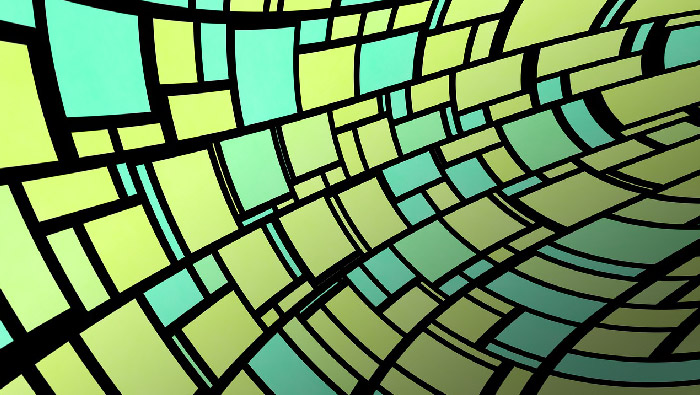
LOGOS: Line patters
Line patters are very good in images to guide the viewer’s eye through the picture. In logo design patterns of lines can suggest an idea. For example the lines of the logo of wifi suggest a radio frequency wave that is being propagated over the air.
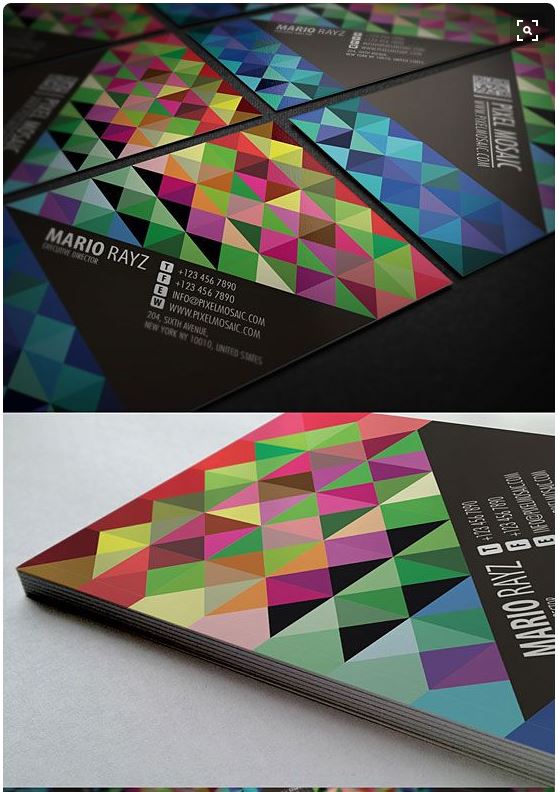
BUSINESS CARDS:Â Shape patterns
Next time you have a business card in your hards, try to find if there are any shape patterns on it. Many business cards add additional shapes to create specific patterns. In the next example, only with one shape (triangle) a very nice pattern is created by combining a different orientation of the triagle & different colors.Â
HOW TO CREATE PATTERNS
Almost all graphic design software’s allow you to create & edit patterns. The principle is quite simple, you create a single design, which later on is reproduced automatically by the software.
(Let me know in the comments if you want me to make a video on this!) The important thing, & especially when you are working with textures, is that the creation of that pattern needs to be seamless. This means that the image no matter how is projected over a surface or a background, it doesn’t have any notion of edges. Many free sites allow you to download free seamless textures.Â
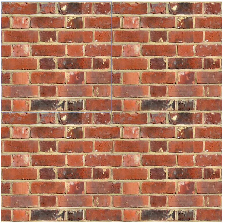
Example of seamless texture
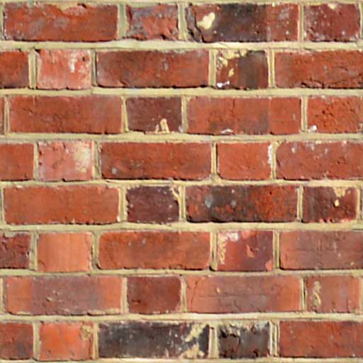
In this case I’m taking a simple brick texture that I downloded from Cadhatch
Instead of trasnform it and expand it to avoid losing quality, I create it with a pattern. You can see that there is no problem. The brick wall just seems to be bigger. The blue square represents the original picture.Â
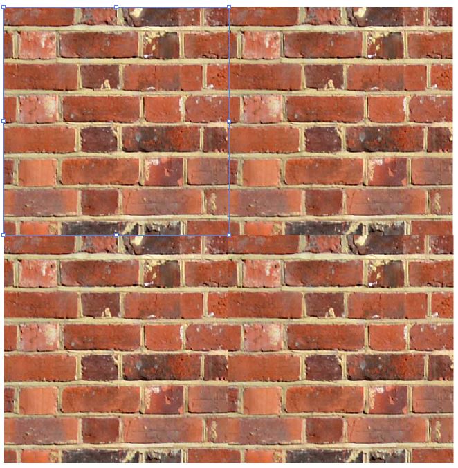
Example of non-seamless texture
Now, if I slightly modify the same picture (just by croping the edges), and do the same process, the results is a non seamless texture.
SUMMARY
In conclusion, graphic designers use patterns in many different ways. It’s important that you start recognizing them to have some inspiration for your future artworks!Â
See you in the next post! If you like the article, please share it!
Leave a comment if you found this post interesting and let me know if you know how you apply patterns.Â
[shareaholic app=”share_buttons” id=”25934634″]