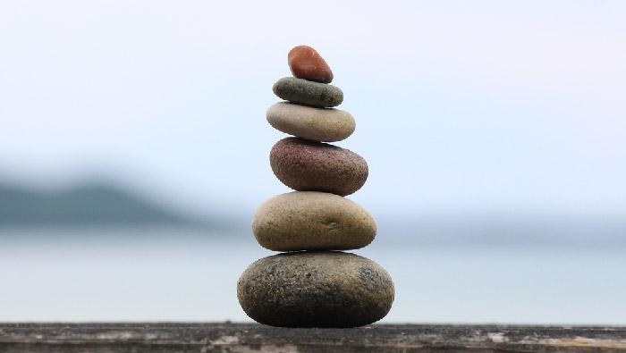
Balance definition
Most humans feel better in places where we can find some sort of stability. Create balanced designs The placement of the elements, the colors and other aspects will play an essential role on how to grab the attention of the human eye. Viewers are uncomfortable when seeing unbalanced compositions. It will create tension because the viewer will not know where to focus. So how can you achieve balance in your graphic designs?
Symmetrical Balance
When an image has symmetrical equilibrium it means that the visual weight is distributed evenly, either vertically or horizontally. Think of a seesaw. The seesaw will be balanced if the 2 people are the same weight and they are at the same distance of the center. You should use simetry when you want to represent something static or to create a sense of harmony, consistency, order. Here some examples of symmetrical logos. Think what type of companies are they… Â
  
Volkswagen
![]()
Starbucks
Asymmetrical balance
Every natural form is asymmetric. Coming back to the example of the seesaw, if one of the 2 persons is bigger than the other, he should move to the center of the seesaw in order to be balance. In graphic design, it means that the elements that are not the same size will not be equally distributed from the center. Another way to achieve asymmetrical balance is to use one big element & create balanced by using other smaller elements. Usually asymmetrical balance create more visual interest. Here some examples of logos:

 Faceebook
Radial Balance
Finally, in order to achieve radial equilibrium, all the elements of the composition emerge from a unique & common center. The advantage of a radial composition is that it’s easy to find the focal point… the center. Continuing with our examples of logos:
 Yamaha
 BP
BP
Conclusion.
In summary, remember that the objective is to achieve a harmonic composition.
It will be your job to understand what your customer is looking for and what message you want to deliver.
See you in the next post! If you like the article, please share it!
Leave a comment if you found this post interesting and let me know how you achieve balance in your designs
[shareaholic app=”share_buttons” id=”25934634″]